<목차>
- Scatter Plot이란
- 실습
import numpy as np
import pandas as pd
import matplotlib as mpl
import matplotlib.pyplot as plt
Scatter Plot이란
- 점을 사용하여 두 feature간의 관계를 알기 위해 사용하는 그래프로, 산점도라고도 불림
- .scatter()을 사용함
- 점의 속성
(1) 색상(color)
(2) 모양(marker) 비추천
(3) 크기(size): 버블 차트라고 부름. 관계보다는 각 점간 비율에 초점을 둘 때 사용. SWOT 분석등에 활용 가능 비추천
fig = plt.figure(figsize=(7, 7))
ax = fig.add_subplot(111, aspect=1)

np.random.seed(970725)

x = np.random.rand(20)
y = np.random.rand(20)
s = np.arange(20) * 20 #0부터 400까지 랜덤 크기로

ax.scatter(x, y,
           s= s, # size
           c='white',
           marker='o',
           linewidth=1, # 테두리
           edgecolor='black')

plt.show()
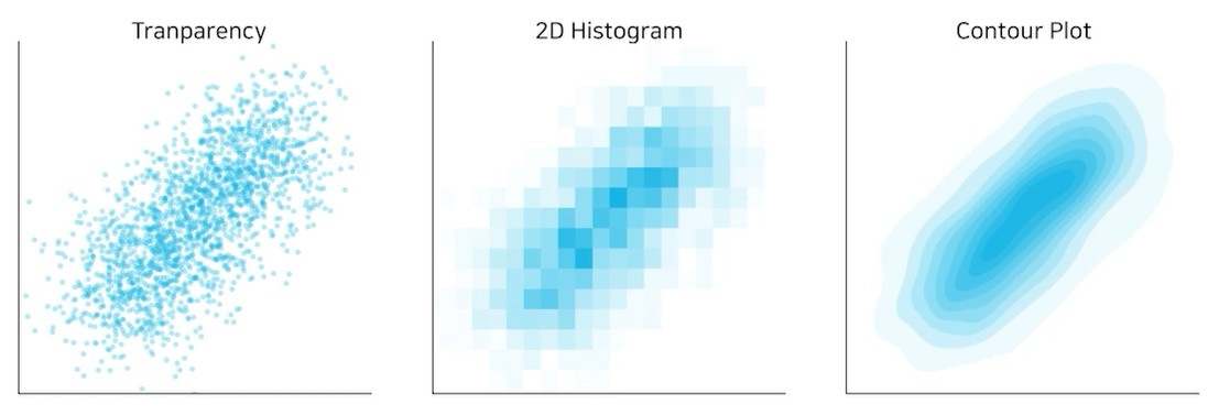
- 각 점이 하나의 데이터를 의미하는데, 점이 많아질수록 점의 분포를 파악하기 어렵다
-> 점이 많아질 때 분포를 파악하는 방법:
(1) 투명도 조정
(2) jittering : 점의 위치를 약간씩 변경 비추천
(3) 2차원 히스토그램 : 히트맵을 사용하여 깔끔한 시각화
(4) Contour plot : 분포를 등고선을 사용해 표현
- 추세선
[tip]
- grip는 지양. 최소한으로, 무채색으로.
- 범주형이 포함된 관계에서는 heatmap 또는 bubble chart를 추천
Scatter Plot을 왜 사용하는가
- 상관 관계(correlation)를 확인하기 쉬움 인과 관계(casual relation)는 아님
- 군집, 값 사이의 차이, 이상치를 확인하기 쉬움

실습을 위한 데이터 준비하기

feature가 sepal length, width / petal length, width로 네 가지인 것 확인
fig = plt.figure(figsize=(7, 7))
ax = fig.add_subplot(111)

ax.scatter(x=iris['SepalLengthCm'], y=iris['SepalWidthCm']) #꽃받침의 길이와 너비의 관계를 살펴보자

plt.show()
조건에 따라 색상 다르게
fig = plt.figure(figsize=(7, 7))
ax = fig.add_subplot(111)

slc_mean = iris['SepalLengthCm'].mean()
swc_mean = iris['SepalWidthCm'].mean()

ax.scatter(x=iris['SepalLengthCm'],
           y=iris['SepalWidthCm'],
           c=['royalblue' if yy <= swc_mean else 'gray' for yy in iris['SepalWidthCm']]
           # 평균보다 작, 클때 다른 색으로
          )

plt.show()
iris의 종류가 세 가지인데 범례를 나눠서 세 번 그리기
fig = plt.figure(figsize=(7, 7))
ax = fig.add_subplot(111)

for species in iris['Species'].unique():
    iris_sub = iris[iris['Species']==species]
    ax.scatter(x=iris_sub['SepalLengthCm'],
               y=iris_sub['SepalWidthCm'],
               label=species)

ax.legend()
plt.show()
=> 양의 상관관계가 있음을 확인 가능
선으로 시각적인 주의 주기
fig = plt.figure(figsize=(7, 7))
ax = fig.add_subplot(111)

for species in iris['Species'].unique():
    iris_sub = iris[iris['Species']==species]
    ax.scatter(x=iris_sub['PetalLengthCm'],
               y=iris_sub['PetalWidthCm'],
               label=species)

ax.axvline(2.5, color='gray', linestyle=':')  #vertical line
ax.axhline(0.8, color='gray', linestyle=':')  #horizontal line
ax.legend()
plt.show()
네 가지 feature 한 번에 비교
fig, axes = plt.subplots(4, 4, figsize=(14, 14))

feat = ['SepalLengthCm', 'SepalWidthCm', 'PetalLengthCm', 'PetalWidthCm']

for i, f1 in enumerate(feat):
    for j, f2 in enumerate(feat):
        if i <= j :
            axes[i][j].set_visible(False)
            continue
        for species in iris['Species'].unique():
            iris_sub = iris[iris['Species']==species]
            axes[i][j].scatter(x=iris_sub[f2],
                               y=iris_sub[f1],
                               label=species,
                               alpha=0.7)
        if i == 3: axes[i][j].set_xlabel(f2)
        if j == 0: axes[i][j].set_ylabel(f1)

plt.tight_layout()
plt.show()

'AI TECH > Data Vizualization' 카테고리의 다른 글
| [matplotlib] Line Plot (1) | 2022.10.05 |
|---|---|
| [matplotlib] Bar Plot (0) | 2022.10.04 |
| 시각화와 matplotlib (0) | 2022.10.04 |