시각화와 matplotlib
Data Visualization 이해하기
1. 데이터 셋의 종류
- 정형 데이터 : csv 파일로 제공되는 테이블 형태의 데이터 (row가 데이터 1개의 item이고, column이 attribute(feature)임)
- 시계열 데이터: 기온, 주가와 같이 시간의 흐름에 따른 데이터. 추세(trend), 계절성(seasonality), 주기성(cycle) 등을 살핌
- 지도/지리 데이터
- 관계 데이터: 객체와 객체 간의 관계를 시각화함(Graph visualization/ Network visualization). 객체는 node, 관계는 link로 표현하고 관계의 가중치를 크기, 색, 수 드응로 표현. 휴리스틱하게 노드 배치 구성
- 계층적 데이터: 관계 중에서도 포함 관계가 분명한 데이터. (ex. Tree, Treemap, Sunburst)
2. 데이터의 종류
| 수치형(numerical) | - 연속형 (continuous) : 길이, 무게, 온도 등 - 이산형 (discrete) : 주사위 눈금, 사람 수 등 |
| 범주형(categorical) | 수로 표현되지만 그게 텍스트인 경우. 수치 자체가 의미가 없음 ex) 별점 4개가 별점1개의 네 배라는 뜻은 아님 - 명목형 (norminal) : 순서가 중요하지 않음. ex) A형이 B형보다 나은 건 아님 혈액형, 종교 등 - 순서형 (ordinal) : 학년, 별점, 등급 등 |
3. 시각화의 요소
| Mark | mark is a basic graphical element in an image 점, 선, 면으로 이루어진 데이터 시각화 |
| Channel | way to control the appearance of marks, independent of the dimensionality of the geometric primitive(기하학적인 원형의 차원에 관계 없이 변경) 각 마크를 변경할 수 있는 요소들 |
전주의적 속성(pre-attentive attribute)이란? 주의를 주지 않아도 인지하게 되는 요소
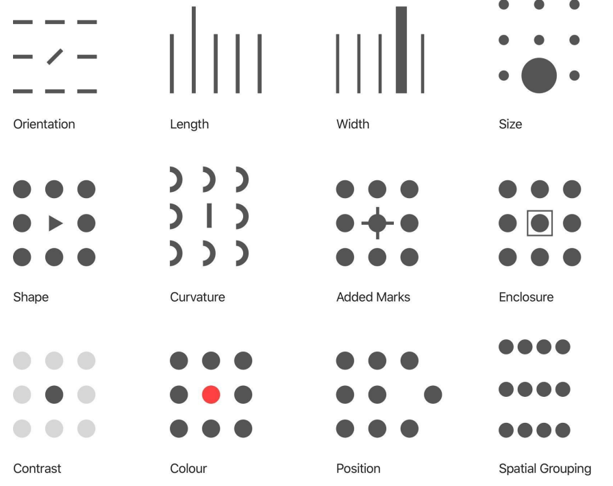
이를 잘 활용해 시각적 분리(visual popout)를 유도해야함.
<목차>
matplotlib
- pyplot
- set color, linestyle, title, legend, grid & xylim
- scatter, bar chart, histogram, boxplot
matplotlib
- pyplot 객체를 사용하여 데이터를 표시
- pyplot 객체에 그래프들을 쌓은 다음 flush
- plt.plot( ) 그림을 그리고 있다가 / plt.show( ) 다 보여주면서 flush
import matplotlib as mplimport matplotlib.pyplot as plt
x = range(100)
y = [value**2 for value in x]
plt.plot(x,y)
plt.show()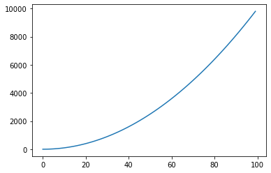
- pyplot 안에 figure라는 판이 있어서 여기에 그림
import matplotlib.pyplot as plt
import numpy as np

X_1 = range(100)
Y_1 = [np.cos(value) for value in X_1]
X_2 = range(100)
Y_2 = [np.sin(value) for value in X_2]

#plt.plot(X_1, Y_1)
#plt.plot(X_2, Y_2)
#plt.show() 하면 하나의 figure에 그래프 두 개 그려짐

fig = plt.figure() #figure 반환
fig.set_size_inches(10,5) #크기 지정
ax_1 = fig.add_subplot(1,2,1) #두 개의 plot 생성
ax_2 = fig.add_subplot(1,2,2)

ax_1.plot(X_1, Y_1, c="b")  # 첫번째 plot
ax_2.plot(X_2, Y_2, c="g")  # 두번째 plot
plt.show() # show & flush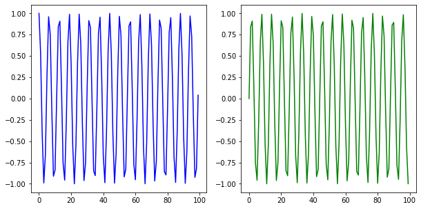
.add_subplot()
- matplotlib에서 그리는 시각화는 Figure라는 큰 틀에 Ax라는 서브플롯을 추가해서 만든다.
- 그래프 두 개 이상 그리고 싶을 때
fig = plt.figure()
#ax = fig.add_subplot(121) # y축을 한 개로 나누고 x축을 2개로 나눔
#ax = fig.add_subplot(1, 2, 1) #로 사용가능
ax = fig.add_subplot(122)
plt.show()
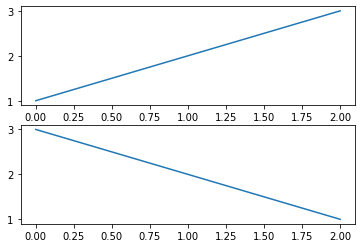
fig = plt.figure()

x1 = [1, 2, 3]
x2 = [3, 2, 1]

ax1 = fig.add_subplot(211)
plt.plot(x1) # ax1에 그리기
ax2 = fig.add_subplot(212)
plt.plot(x2) # ax2에 그리기
plt.show()
plt로 그리다 plt.gcf().get_axes()로 다시 서브플롯 객체를 받아서 사용할 수도 있음
Matplotlib은 그릴 때 두 가지 API를 따로 지원합니다.
1. Pyplot API : 순차적 방법객체지향(Object-Oriented)
2. API : 그래프에서 각 객체에 대해 직접적으로 수정하는 방법
위처럼 plt로 그리는 그래프들은 순차적으로 그리기에 좋습니다.
하지만 프로그래밍 스타일에 따라 (보편적인 Python)에서는 꼭 순차적으로 그리지만은 않습니다.
좀 더 pythonic하게 구현을 하려면 어떻게 해야할까요?
subplot 객체 ax 그리기
fig = plt.figure()

x1 = [1, 2, 3]
x2 = [3, 2, 1]

ax1 = fig.add_subplot(211)
ax2 = fig.add_subplot(212)

ax1.plot(x1)
ax2.plot(x2)
plt.show()
- 한 subplot에서 여러 개 그리기
fig = plt.figure()
ax = fig.add_subplot(111)
# 3개의 그래프 동시에 그리기
ax.plot([1, 1, 1]) # 파랑
ax.plot([1, 2, 3]) # 주황
ax.plot([3, 3, 3]) # 초록

plt.show()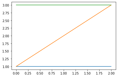
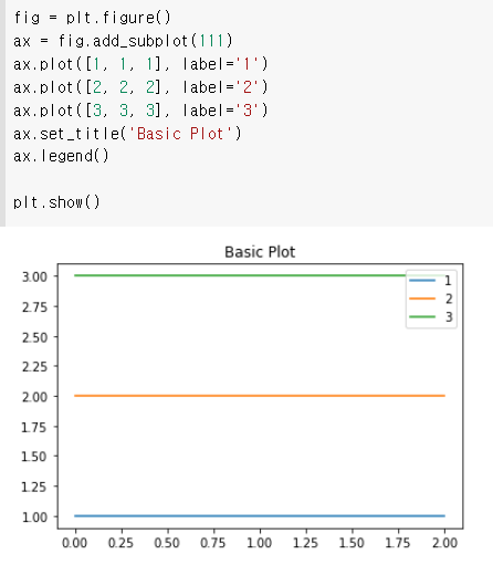
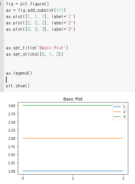
- 범례(legend) : 시각화에서 차트의 요소들이 드러나도록 함
fig = plt.figure()
ax = fig.add_subplot(111)
ax.plot([1, 1, 1], label='1')
ax.plot([2, 2, 2], label='2')
ax.plot([3, 3, 3], label='3')
ax.legend()
plt.show()
- 두 개의 그래프 그리고 정보 추가하기 fig.subtitle()
fig = plt.figure()
ax1 = fig.add_subplot(1,2,1)
ax2 = fig.add_subplot(1,2,2)
ax1.set_title('ax1')
ax2.set_title('ax2')

fig.suptitle('fig') #super에서 온 것임
plt.show()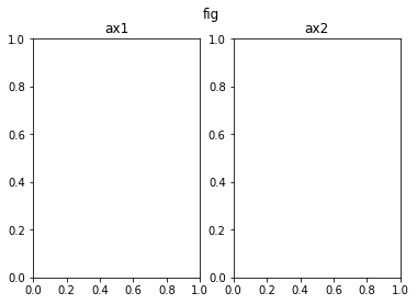
ax에서 특정 데이터를 변경하는 경우 .set_{}() 형태의 메서드가 많습니다. 예를 들면 set_title
set으로 세팅하는 정보들은 반대로 해당 정보를 받아오는 경우에는 .get_{}() 형태의 메서드를 사용합니다.
ex) print(ax.get_title())
- 축 ticks와 ticklabels로 구분됨
| ticks | 축에 적히는 수 위치 |
| ticklabels | 축에 적히는 텍스트를 수정 |
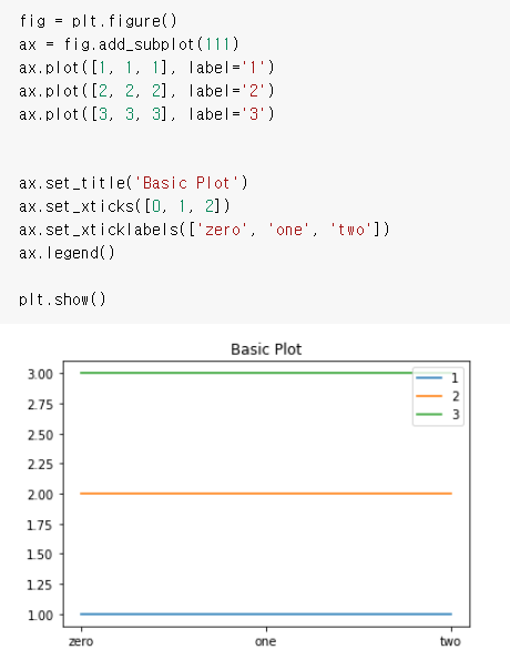
- 그래프에 텍스트 추가 ax.text
fig = plt.figure()
ax = fig.add_subplot(111)
ax.plot([1, 1, 1], label='1')
ax.plot([2, 2, 2], label='2')
ax.plot([3, 3, 3], label='3')

ax.set_title('Basic Plot')
ax.set_xticks([0, 1, 2])
ax.set_xticklabels(['zero', 'one', 'two'])
ax.text(x=1, y=2, s='This is Text')
ax.legend()
plt.show()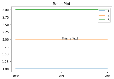
- 그래프에 주석 추가 ax.annotate(text, xy)
fig = plt.figure()
ax = fig.add_subplot(111)
ax.plot([1, 1, 1], label='1')
ax.plot([2, 2, 2], label='2')
ax.plot([3, 3, 3], label='3')

ax.set_title('Basic Plot')
ax.set_xticks([0, 1, 2])
ax.set_xticklabels(['zero', 'one', 'two'])

ax.annotate('This is Annotate', xy=(1, 2))

ax.legend()
plt.show()
주석에 화살표 추가
ax.annotate('This is Annotate', xy=(1, 2),
xytext=(1.2, 2.2),
arrowprops=dict(facecolor='black'),
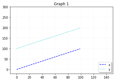
)matplotlib - set color, linestyle, title, legend(범례) , grid & xylim(graph 보조선)
import matplotlib.pyplot as plt
import numpy as np

X_1 = range(100)
Y_1 = [value for value in X_1]

X_2 = range(100)
Y_2 = [value + 100 for value in X_2]

plt.plot(X_1, Y_1, c="b", ls="dashed", label = 'x')
plt.plot(X_2, Y_2, c="c", ls="dotted", label = 'y')
plt.title("Graph 1") #Latex 타입(수식)도 표현 가능
plt.legend(shadow = True, fancybox = True, loc = "lower right") #범례
plt.grid(True, lw= 0.4, ls ="--", c=".90")
plt.xlim(-10,150)
plt.ylim(-20,300)
더 자세한 내용은 https://wikidocs.net/book/5011
matplotlib - scatter, bar chart, histogram, boxplot
scatter
- marker은 scatter 모양 지정, s는 데이터 크기를 지정
import matplotlib.pyplot as plt
import numpy as np

data_1 = np.random.rand(512,2)
data_2 = np.random.rand(512,2)

plt.scatter(data_1[:, 0], data_2[:,1], c= "b", marker="x") #plt.scatter(x,y)
plt.scatter(data_2[:, 0], data_1[:,1], c= "r", marker="^")

plt.show()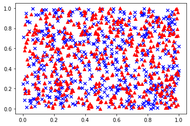
import matplotlib.pyplot as plt
import numpy as np

N = 60
x = np.random.rand(N)
y = np.random.rand(N)
colors = np.random.rand(N)
area = np.pi * (15*np.random.rand(N))**2
plt.scatter(x, y, s= area, c= colors, alpha = 0.3)
plt.show()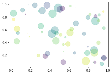
Bar Chart
import matplotlib.pyplot as plt
import numpy as np

x = np.arange(3)
years = ['2018', '2019', '2020']
values = [100, 400, 900]
colors = ['y', 'dodgerblue', 'C2']

plt.bar(x, values, color=colors)
plt.xticks(x, years)

plt.show()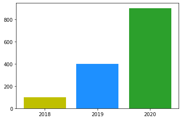
Histogram
- 도수분포표를 그래프로 나타낸 것, 가로축은 계급, 세로축은 도수 (횟수나 개수 등)를 나타냄
- bins 파라미터는 히스토그램의 가로축 구간의 개수를 지정
import matplotlib.pyplot as plt

weight = [68, 81, 64, 56, 78, 74, 61, 77, 66, 68, 59, 71,
          80, 59, 67, 81, 69, 73, 69, 74, 70, 65]

plt.hist(weight, label='bins=10')
plt.hist(weight, bins=30, label='bins=30')
plt.legend()
plt.show()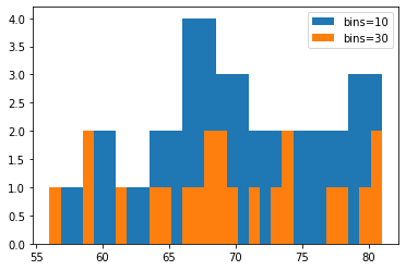
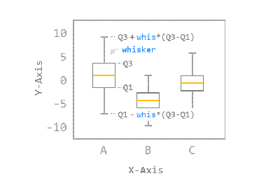
boxplot
- 일반적으로 박스 플롯은 전체 데이터로부터 얻어진 아래의 다섯 가지 요약 수치를 사용해서 그려집니다.
- 최소값
- 제 1사분위 수 (Q1)
- 제 2사분위 수 또는 중위수 (Q2)
- 제 3사분위 수 (Q3)
- 최대값
사분위 수는 데이터를 4등분한 지점을 의미합니다.
예를 들어, 제 1사분위 수는 전체 데이터 중 하위 25%에 해당하는 값이고, 제 3사분위 수는 전체 데이터 중 상위 25%에 해당하는 값입니다.
import matplotlib.pyplot as plt
import numpy as np

# 1. 기본 스타일 설정
plt.style.use('default')
plt.rcParams['figure.figsize'] = (4, 3)
plt.rcParams['font.size'] = 12

# 2. 데이터 준비
np.random.seed(0)
data_a = np.random.normal(0, 2.0, 1000)
data_b = np.random.normal(-3.0, 1.5, 500)
data_c = np.random.normal(1.2, 1.5, 1500)

# 3. 그래프 그리기
fig, ax = plt.subplots()

ax.boxplot([data_a, data_b, data_c])
ax.set_ylim(-10.0, 10.0)
ax.set_xlabel('Data Type')
ax.set_ylabel('Value')

plt.show()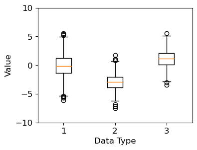
ax.boxplot()은 주어진 데이터 어레이로부터 얻어진 요약 수치를 박스 형태로 나타냅니다.
np.random 모듈의 normal() 함수는 정규 분포로부터 난수를 생성합니다.
세 개의 난수 데이터 어레이를 리스트 형태로 입력했습니다.
가운데 박스 모양으로부터 그려지는 중심선을 수염 (Whisker)이라고 합니다.
boxplot() 함수는 기본적으로 박스의 위쪽 경계로부터 Q3 + whis*(Q3-Q1)까지,
박스의 아래쪽 경계로부터 Q1 - whis*(Q3-Q1)까지 수염 (Whisker)을 나타냅니다.