[matplotlib] Bar Plot
<목차>
- bar plot이란
- multiple bar chart
- 원칙
import numpy as np
import pandas as pd
import matplotlib as mpl
import matplotlib.pyplot as plt
Bar plot이란
- 막대 그래프, bar chart, bar graph의 이름으로 불리는 직사각형 막대를 사용해 데이터의 값을 표현하는 차트 또는 그래프
- 범주(category)에 따른 수치 값을 비교하기에 적합한 방법임
- 막대의 방향에 따라서 분류할 수 있음

- bar() : 기본적인 bar
- plotbarh() : horizontal bar plot
fig, axes = plt.subplots(1, 2, figsize=(12, 7))

x = list('ABCDE')
y = np.array([1, 2, 3, 4, 5])

axes[0].bar(x, y)
axes[1].barh(x, y)

plt.show()
막대 그래프의 색은 전체 혹은 일부로 변경 가능하다.
단, 개별로 변경하고 싶은 경우 색을 list의 형태로 전해야 함.
fig, axes = plt.subplots(1, 2, figsize=(12, 7))

x = list('ABCDE')
y = np.array([1, 2, 3, 4, 5])

clist = ['blue', 'gray', 'gray', 'gray', 'red']
color = 'green'
axes[0].bar(x, y, color=clist)
axes[1].barh(x, y, color=color)

plt.show()
Multiple Bar plot
- Bar plot은 1개의 feature에 대해서만 보여주기 때문에 여러 group를 보여주려면 다양한 방법이 필요하다
- plot을 여러 개 그리기보다는 한 개의 plot에 동시에 나타내기(쌓아서/겹쳐서/이웃에 배치해 표현)
두 개의 그래프가 같은 y축을 사용하기 위해서는 sharey 파라미터를 사용하거나 y축 범위를 개별적으로 조정
fig, axes = plt.subplots(1, 2, figsize=(15, 7), sharey=True)
axes[0].bar(group['male'].index, group['male'], color='royalblue')
axes[1].bar(group['female'].index, group['female'], color='tomato')
plt.show()
fig, axes = plt.subplots(1, 2, figsize=(15, 7))
axes[0].bar(group['male'].index, group['male'], color='royalblue')
axes[1].bar(group['female'].index, group['female'], color='tomato')
for ax in axes:
ax.set_ylim(0, 160)
plt.show()Stacked Bar plot
- 2개 이상의 그룹을 쌓아서(stack) 표현하는 bar plot
- 각 bar에서 나타나는 그룹의 순서는 항상 유지함 => 맨 밑의 bar의 분포는 파악하기 쉽지만 그 외의 분포들은 파악하기 어려움
- 2개의 그룹이 positive/negative라면 축 조정 가능
.bar()에서는 bottom 파라미터를 사용
.barh()에서는 left 파라미터를 사용
fig, axes = plt.subplots(1, 2, figsize=(15, 7))

group_cnt = student['race/ethnicity'].value_counts().sort_index()
axes[0].bar(group_cnt.index, group_cnt, color='darkgray')
axes[1].bar(group['male'].index, group['male'], color='royalblue')
axes[1].bar(group['female'].index, group['female'], bottom=group['male'], color='tomato')

for ax in axes:
    ax.set_ylim(0, 350)

plt.show()
- 응용하여 전체에서 비율을 나타내는 Percentage Stacked Bar Chart가 있음
fig, ax = plt.subplots(1, 1, figsize=(12, 7))

group = group.sort_index(ascending=False) # 역순 정렬 (위에서부터 groupA)
total=group['male']+group['female'] # 각 그룹별 합


ax.barh(group['male'].index, group['male']/total,
        color='royalblue')

ax.barh(group['female'].index, group['female']/total,
        left=group['male']/total,
        color='tomato')

# 깔끔해보이게
ax.set_xlim(0, 1)  # x축 범위 변경
for s in ['top', 'bottom', 'left', 'right']: # 검정선 제거
    ax.spines[s].set_visible(False)

plt.show()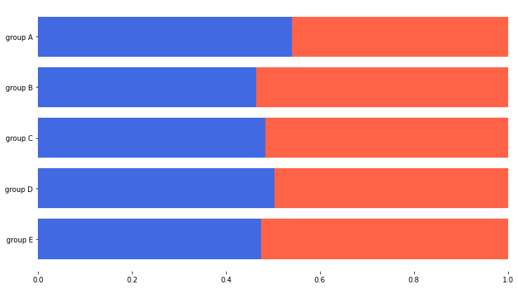
Overlapped Bar plot
- 2개의 그룹을 비교하는 경우 같은 축을 사용하니 비교가 쉬움
- 투명도를 조정하여 겹치는 부부 파악 (alpha)
group = group.sort_index() # 다시 정렬

fig, axes = plt.subplots(2, 2, figsize=(12, 12))
axes = axes.flatten()

for idx, alpha in enumerate([1, 0.7, 0.5, 0.3]):
    axes[idx].bar(group['male'].index, group['male'],
                  color='royalblue',
                  alpha=alpha)
    axes[idx].bar(group['female'].index, group['female'],
                  color='tomato',
                  alpha=alpha)
    axes[idx].set_title(f'Alpha = {alpha}')

for ax in axes:
    ax.set_ylim(0, 200)

plt.show()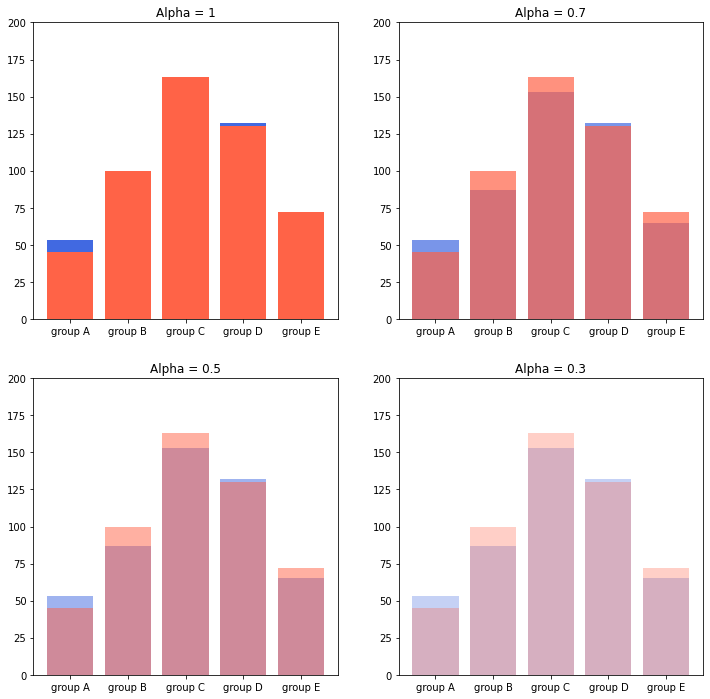
Grouped Bar plot
- 그룹이 5~7개 이하일 때 효과적
- Matplotlib으로는 비교적 구현이 까다로움 -> 적당한 테크닉 사용 (.set_xticks(), .set_xticklabels())
크게 3가지 테크닉으로 구현 가능합니다.
[1] x축 조정 [2] width 조정 [3] xticks, xticklabels
원래 x축이 0, 1, 2, 3로 시작한다면
- 한 그래프는 0-width/2, 1-width/2, 2-width/2 로 구성하면 되고
- 한 그래프는 0+width/2, 1+width/2, 2+width/2 로 구성하면 됩니다.
fig, ax = plt.subplots(1, 1, figsize=(12, 7))

idx = np.arange(len(group['male'].index))
width=0.35 # 하나의 막대가 꽉 차면 1임. 여기서는 2개의 막대이므로 0.35*2=0.7의 두께

ax.bar(idx-width/2, group['male'],
       color='royalblue',
       width=width)

ax.bar(idx+width/2, group['female'],
       color='tomato',
       width=width)

ax.set_xticks(idx)
ax.set_xticklabels(group['male'].index)

plt.show()
그룹의 개수에 따라 x좌표는 다음과 같음
- 2개 : -1/2, +1/2
- 3개 : -1, 0, +1 (-2/2, 0, +2/2)
- 4개 : -3/2, -1/2, +1/2, +3/2
그룹이 N개 일때는 -(N-1)/2에서 (N-1)/2까지 분자에 2간격으로 커지는 것이 특징임
즉, index i에 대해서 x좌표는 다음과 같음

group = student.groupby('parental level of education')['race/ethnicity'].value_counts().sort_index()
group_list = sorted(student['race/ethnicity'].unique())
edu_lv = student['parental level of education'].unique()

fig, ax = plt.subplots(1, 1, figsize=(13, 7))

x = np.arange(len(group_list))
width=0.12

for idx, g in enumerate(edu_lv):
    ax.bar(x+(-len(edu_lv)+1+2*idx)*width/2, group[g],
       width=width, label=g)

ax.set_xticks(x)
ax.set_xticklabels(group_list)
ax.legend()

plt.show()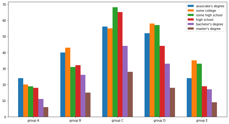
원칙
1. Principle of Proportion Ink
실제 값과 그에 표현되는 그래픽으로 표현되는 잉크 양은 비례해야 함
반드시 x축의 시작은 0임
2. 데이터 정렬하기
- Pandas에서는 sort_values(), sort_index()를 사용하여 정렬
- 데이터의 종류에 따라 다음 기준으로
1. 시계열 | 시간순 2. 수치형 | 크기순 3. 순서형 | 범주의 순서대로 4. 명목형 | 범주의 값 따라 정렬
- 대시보드에서는 Interactive로 제공하는 것이 유용
3. 적절한 공간 활용
- 여백과 공간만 조정해도 가독성이 높아진다.
- Matplotlib의 bar plot은 ax에 꽉 차서 살짝 답답함
- Matplotlib techniques
o X/Y axis Limit (.set_xlim(), .set_ylime())
o Spines (.spines[spine].set_visible())
o Gap (width)
o Legend (.legend())
o Margins (.margins())
4. 단순함
- 2차원, 직사각형의 bar이 가장 좋다
- 무의미한 3D는 지양하자 -> 써야 한다면 interactive 활용
- 축과 디테일을 조정하는 요소
o Grid (.grid())
o Ticklabels (.set_ticklabels())
o Major & Minor
o Text를 어디에 어떻게 추가할 것인가 (.text() or .annotate())
o Bar의 middle / upper
5. 그 외
- errorbar: 오차 막대로 uncertainty 정보 추가 가능
- bar 사이 gap이 0이라면 히스토그램 사용 .hist() 사용
- 다양한 Text 정보 활용하기
o 제목 (.set_title())
o 라벨 (.set_xlabel(), .set_ylabel())
fig, ax = plt.subplots(1, 1, figsize=(10, 10))

idx = np.arange(len(score.index))
width=0.3


ax.bar(idx-width/2, score['male'],
       color='royalblue',
       width=width,
       label='Male',
       yerr=score_var['male'], #y 축의 범위로 error을 표시
       capsize=10 #위 아래 찍찍이 cap임
      )

ax.bar(idx+width/2, score['female'],
       color='tomato',
       width=width,
       label='Female',
       yerr=score_var['female'],
       capsize=10
      )

ax.set_xticks(idx)
ax.set_xticklabels(score.index)
ax.set_ylim(0, 100)
ax.spines['top'].set_visible(False)
ax.spines['right'].set_visible(False)

ax.legend()
ax.set_title('Gender / Score', fontsize=20)
ax.set_xlabel('Subject', fontweight='bold')
ax.set_ylabel('Score', fontweight='bold')

plt.show()
실습을 위한 데이터 준비하기
1000명의 학생에 대해 아래의 feature에 대한 정보를 가진 데이터
- 성별 : female / male
- 인종민족 : group A, B, C, D, E
- 부모님 최종 학력 : 고등학교 졸업, 전문대, 학사 학위, 석사 학위, 2년제 졸업
- 점심 : standard와 free/reduced
- 시험 예습 : none과 completed
- 수학, 읽기, 쓰기 성적 (0~100)
주의: 아래의 실행결과는 10명의 학생 데이터이므로 1000명일 때와 다름
student = pd.read_csv('/content/exams.csv')
student.sample(5) #head()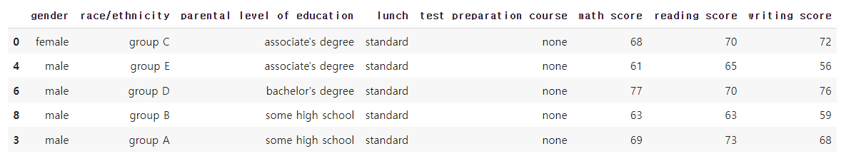
student.info() #수치와 범주 mapping
student.describe(include='all') #unique를 주의해서 보자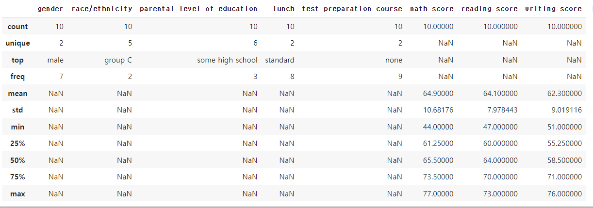
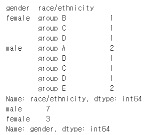
간단하게 성별에 따른 인종 분포를 살펴보자
group = student.groupby('gender')['race/ethnicity'].value_counts().sort_index()
# value_counts() 없으면 표로 안 뜸 # sort_index() 없으면 값이 큰 것부터 print
display(group)
print(student['gender'].value_counts())